
Brand style guide · Concept brand
Lido Watches
An affordable luxury watch brand inspired by Lido Isle, Newport Beach. Logo, identity and the Shopify storefront built on it.

01 Logo system



- The trident always sits centered above the wordmark, a nod to Newport's harbor and the sea.
- The gold rule and spaced "WATCHES" appear only in the full lockup, which leads on packaging and the site header.
- The trident works alone on dials, crowns, clasps, favicons and embossed packaging.
02 Color
- Lido Green
#053827RGB 5 56 39Wordmark, packaging, dark sections - Riviera Gold
#C9A84CRGB 201 168 76Trident, rules, primary buttons - Sand
#F0EBE3RGB 240 235 227Storefront backgrounds, cards - White
#FFFFFFRGB 255 255 255Product photography, base
03 Typography
Aa
Cormorant Garamond
Editorial headlines · 500–700 · a classic serif to match the wordmark
Aa
Inter
Storefront UI, product details, eyebrows (spaced caps)
Affordable luxury watches · Newport Beach
Made for the Coast.
Designed for daily wear, built to last.
Affordable luxury watches inspired by Lido Isle, Newport Beach. Designed for daily wear, built to last. Men's watches starting at $79.
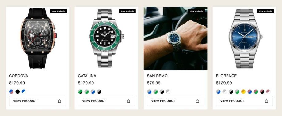
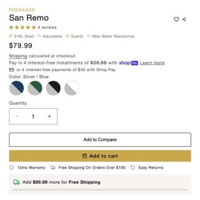
04 Storefront UI
05 Voice
- Lead with value: the look and finish of a luxury piece at an everyday price.
- Use Newport and coastal references with restraint: the harbor, Lido Isle, golden hour.
- Never compare by name to luxury maisons or imply an affiliation with them.
06 Approved pairings
| Aa | White on Lido Green | 13.11:1 | AAA |
| Aa | Riviera Gold on Lido Green | 5.74:1 | AA |
| Aa | Lido Green on Sand | 11.05:1 | AAA |
| Aa | Lido Green on White | 13.11:1 | AAA |
Every core pairing in the Lido palette passes WCAG AA for body text, so the brand reads well on every surface.